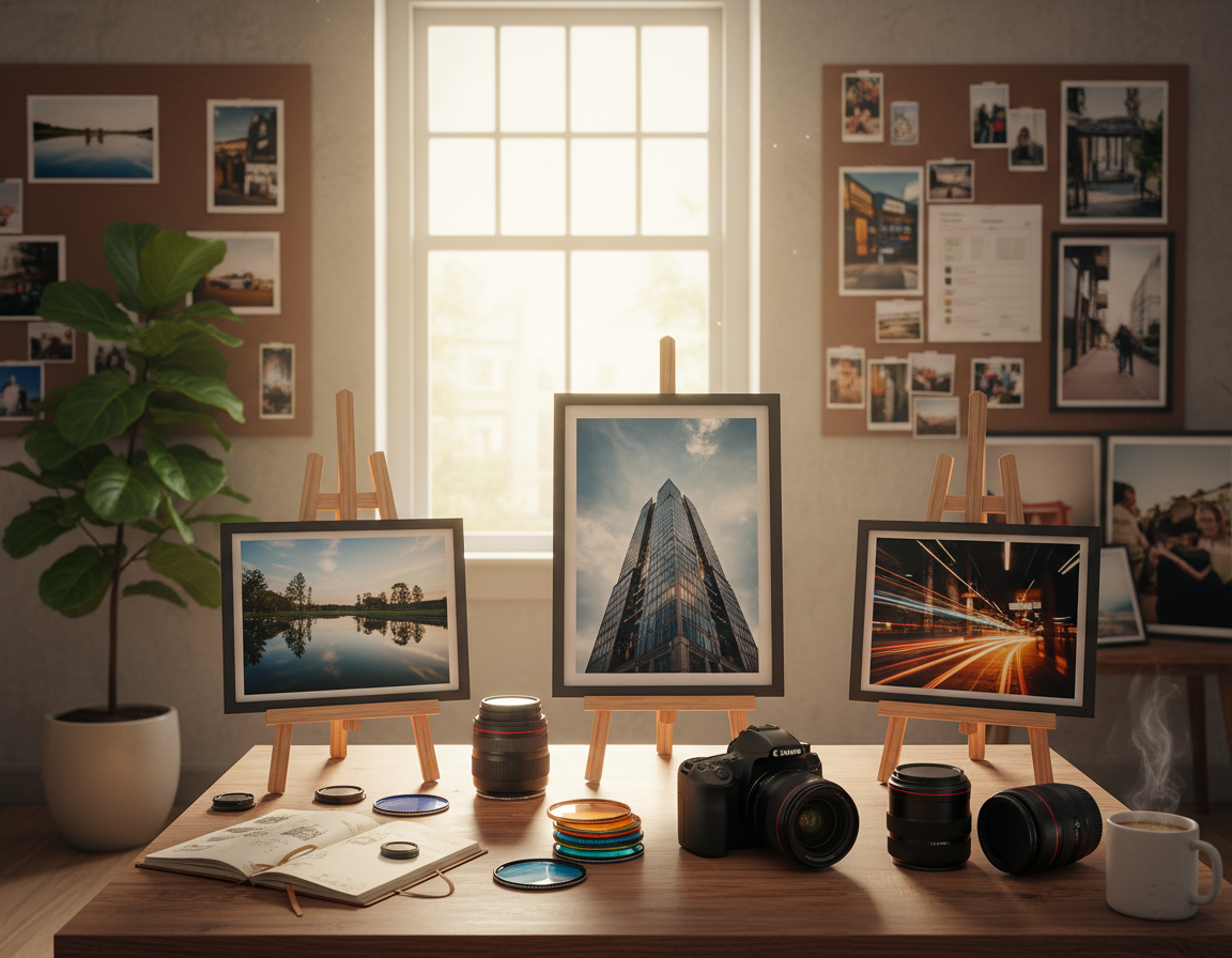
Capturing the moment is only the start. Small, intentional edits can reveal detail, set a mood, and help tell a story without changing what you saw. This short guide shows a practical order that works for most images.
Start with a preset or filter, then crop and straighten. Next adjust light and tone, refine color, and enhance detail. Try subtle film looks and save recipes for a consistent style.
Whether you edit on a phone, tablet, or computer, these repeatable steps deliver better photos faster than random slider moves. Small changes usually outperform heavy edits, and consistency matters more than chasing perfect settings for every shot.
Goal first, tools second: decide if the image should feel bright, moody, warm, cinematic, or true-to-life before you start. Success means better results that still look believable for social posts, portfolios, or prints.
Set Yourself Up for Clean, Accurate Edits
Start by matching your tools to the job: the device and screen you use shape every adjustment you make. A reliable display prevents surprises when an image appears on other screens or in print.
Choose the right device and display
Phone-only workflows work for quick social work. A tablet with a stylus fits retouch and local work. For precise color and fine detail, use a larger monitor like a Dell UltraSharp U2419H, ASUS ProArt PA278QV, LG 27UL500-W, or Acer ConceptD CM2.
Calibrate color for consistent results
Calibration keeps tones steady across devices. Use a hardware calibrator or built-in profiles. Consistent color helps skin tones, product hues, and print matches stay true.
Pick a program that fits your process
Match software to the job: Lightroom-style programs are great for batch work and organization. Photoshop-style programs handle deep retouch and composites. Fast AI tools like Luminar AI speed common fixes. Free mobile options such as Snapseed let you work on the go.
“A good screen and a simple workflow save more time than chasing complex settings.”
- Workspace checklist: neutral lighting, no direct sun, steady brightness, and a reference image.
- Commit to one primary program for a few weeks to build speed and muscle memory.
Start Fast With Presets and Photo Filters
Start with a one-tap preset to establish color and contrast before making small fixes. Presets and filters are a fast way to set tone, contrast, and color direction in a single step. They work especially well when a set of images shares lighting or location.
When a preset is the best first move
Use a preset when you need a cohesive feed or when an image only needs a signature finish. Pick logically: portrait-friendly for people, landscape-friendly for wide scenes, or film-inspired for mood. This saves time and creates a consistent look across a set.
Control strength so the style supports the image
Dial the Strength or Amount slider down first. Start low and increase only until the image still looks natural. Strength prevents over-stylized results and keeps details intact.
Save recipes for repeatable, faster results
Create and name custom presets like “indoor warm light portraits” or “overcast street” so you know when to use each one. A saved recipe reduces decisions and speeds batch work.
When you apply a preset, make just a couple of small adjustments—exposure, white balance, or a minor crop—rather than stacking many effects. For more on a practical workflow, see Lightroom workflow guidance.
Fix Composition With Crop, Straighten, and Skew
Before you adjust light or color, decide what stays in the frame. Composition changes what the viewer notices and affects every later exposure and color decision. Start by making the subject clear and removing distractions.
Crop to emphasize and remove distractions
Use crop to remove clutter and emphasize your subject. Crop until the edge of the frame stops competing with the main element.
Rule of thirds helps: align subjects and strong lines on grid intersections to create balance. Grids make this simple for beginners.
Straighten horizons and lines
Use a grid to level horizons, tables, and building lines. Zoom in slightly to catch subtle tilts that can feel off at full size.
Correct skew for architecture and interiors
Apply perspective correction when tall buildings lean inward from wide lenses or tilt. Skew fixes vertical and horizontal distortion for a natural look.
Make images social-ready without losing detail
Use common aspect ratios (1:1, 4:5, 16:9) but protect key details — faces, hands, and product edges — when reframing. When possible, leave extra room when you shoot so you can crop for different platforms later.
For a deeper look at composition and practical cropping, see the composition and cropping guide.
Get the Light Right With Exposure, Contrast, and Tone
The right exposure and subtle tone work make an image feel honest and three-dimensional.
Start with exposure. Raise it when shadow detail disappears. Lower it when highlights look washed out or white with no detail.
Quick ways to add depth without damage
Use contrast to separate darks and lights, but watch for crushed shadows or clipped highlights.
Avoid heavy contrast on dark hair, suits, or night skies so texture stays visible.
Refine tones with highlights and shadows
Highlights and shadow sliders recover detail more selectively than a global exposure move.
This preserves dynamic range—the ability to keep information in bright and dark areas at once.
Brightness vs. exposure
Brightness shifts overall lightness; exposure changes the image’s base exposure. Test small moves and watch for blown highlights or muddy shadows.
- Micro-workflow: exposure → contrast → highlights/shadows → re-check exposure.
- Natural-look check: skin texture stays, clouds hold shape, blacks keep depth.
| Control | Primary Effect | When to Use | Risk |
|---|---|---|---|
| Exposure | Global light level | Recover dark or bright images | Blown highlights or lost shadows |
| Brightness | Overall lightness | Small global lift | Muddy midtones |
| Contrast | Separation of tones | Add depth | Crushed detail |
| Highlights / Shadows | Selective tone control | Balance dynamic range | Unnatural flatness if overdone |
Dial In Color With White Balance, Vibrance, and Saturation
Getting color right helps viewers accept a photo as natural and believable.
White balance removes unwanted color casts so whites look white and skin appears true under different lights.
Temperature and tint basics
Temperature shifts warm to cool. Use it to fix tungsten warmth or shade that turns blue.
Tint corrects green or magenta shifts common under fluorescent fixtures.
Vibrance versus saturation
Vibrance raises muted colors more than already-rich tones and protects skin. It is a safer choice for portraits.
Saturation boosts every color equally and suits bold, deliberate looks. Avoid overuse to prevent neon skin or radioactive foliage.
Target colors with HSL
HSL tools let an editor change one hue without altering the whole image. For example, deepen a blue sky or calm an oversaturated red sign.
Work order: set exposure and tone first, then adjust white balance and HSL. Finally, review colors on another calibrated screen for consistent results.
| Control | Primary Effect | When to Use |
|---|---|---|
| Temperature / Tint | Correct color cast | Match scene lighting |
| Vibrance | Selective boost | Portraits, mixed tones |
| Saturation | Global intensity | Stylized or bold looks |
| HSL | Targeted hue control | Adjust specific colors |
Sharpen, Clarity, and Blur: Detail Edits That Make Photos Pop
Final texture and edge work often decides whether an image feels polished or unfinished. Do these edits near the end, after you set exposure and color.
Clarity: midtone texture with care
Clarity raises midtone contrast so skin, fabric, and architecture read with more depth. Use it lightly on portraits; too much makes faces look harsh.
Sharpening: crisp edges without the crunch
Sharpening targets fine edges for a crisp look. Oversharpening creates halos and noisy edges—especially in low-light images. Zoom to 100% to judge results.
Blur: selective softening to guide the eye
Use blur to reduce distractions and mimic bokeh. A soft background pushes the subject forward when the original depth of field is busy.
- Difference: clarity affects larger textures; sharpening refines small details.
- Apply detail controls last; they change perceived contrast and noise.
- Adjust for your lens, camera, and output size—social images usually need less sharpening than prints.
| Control | Primary Effect | When to Use |
|---|---|---|
| Clarity | Midtone contrast, texture | Enhance fabric, landscape texture; use low for skin |
| Sharpening | Edge definition | Final crispness for web or print; check at 100% |
| Blur | Background softening | Emphasize subject, simulate shallow depth of field |
Retouch and Cleanup Tools for Polished Images
A quick cleanup pass brings attention back to the subject and speeds the rest of your process. Cleanup means removing small, accidental distractions—dust spots, stray hairs, sensor spots, blemishes, and background clutter that pull focus away from the main element.
Choose the right approach for the size of the blemish. Use healing tools for tiny specks and the Patch Tool or Content-Aware Fill for larger areas with texture. Sampling from similar texture keeps fills believable.
Practical workflow for precise work
Work zoomed in for accuracy, but keep a second window or frequent full-frame checks so fixes stay natural at normal view. This prevents retouch from becoming obvious when seen at output size.
When background removal is worth it
Background removal pays off for product shots, profile images, composites, or whenever the background harms the subject. Hard edges suit the Pen Tool or Quick Selection; soft, hair-rich edges need masks and careful refinement.
- Tools: Background Removal, Magic Wand, Magic Eraser, Pen Tool, Quick Selection—pick by edge type and scene complexity.
- Expectations: Hair, fur, and transparency take more time and skill; skip deep fixes for casual social posts unless needed.
- Ethics: For portraits, preserve skin texture and identity—remove temporary distractions, not natural features.
Keep cleanup subtle: polished, not altered.
For workflow ideas that expand on process and style, see how to elevate your photography with repeatable practices.
Photo Editing Tips for a Film Look on Digital Images
A film-inspired finish gives digital images warmth, texture, and the sense of a well-loved print. Aim for subtlety: controlled grain, a soft tonal roll-off, and small analog accents keep the result believable.
Add film grain without turning your photo into noisy grit
Grain differs from noise. Grain feels even and film-like; noise looks blotchy and color-shifted. Add grain after you set exposure and color so it reads as texture, not a correction for poor capture.
Use fade for softer shadows and a vintage print feel
Fade lifts deep shadows and softens contrast. Apply gently to keep detail in faces and fabrics. This creates a print-like tone roll-off that reads nostalgic without flattening the image.
Try film frames, light leaks, and lens flares for analog character
Overlays work as accents, not staples. Use frames and light leaks to support the story—summer drives, concerts, or road-trip light. Keep them subtle and avoid covering eyes, logos, or product features.
Choose film-inspired presets to emulate classic stocks
Pick presets that match subject and lighting: warm Portra-like tones for portraits or vivid Velvia-style color for landscapes. Use classic stocks as a guide for consistent color and mood.
- Quick guardrails: add grain last, protect skin tones, and keep subject separation clear.
- Final realism check: read the tones and make sure the main element still stands out.
Build a Repeatable Workflow and Find Your Editing Style
A repeatable workflow turns guesswork into a clear process and saves time on every image. Start each file with global fixes—exposure, white balance, and lens corrections in RAW tools—then move to local adjustments and final detail work.

Edit with purpose
Choose the feeling you want: clean, warm, moody, cinematic, or true-to-life. Let that goal guide every slider so your work stays intentional.
Batch work and saved recipes
Use saved recipes or presets for sets from the same shoot. Batch processing saves time and keeps a consistent style across images.
Avoid over-editing by comparing stages
Make version duplicates, use history snapshots, or Layer Comps in Photoshop to compare stages. See the difference at checkpoints and stop when the image improves, not just changes.
Learn from photographers and experiment
Study photographers you admire and pay attention to patterns: contrast, color temperature, grain, and framing. Experiment by changing one variable at a time and keep short notes. Revisit edits after a week to see what still works.
Practical rule: global → local → detail → compare. Repeat until the result matches your intention.
| Step | Primary Focus | Tool Example | When to Use |
|---|---|---|---|
| Global Adjust | Exposure, white balance, lens | Adobe Camera Raw | Open RAW files first |
| Local Work | Retouch, selective tone | Masking / Brush | Faces, product areas |
| Detail & Finish | Sharpen, grain, clarity | Sharpening panel | Final output check |
| Compare & Batch | Versioning, presets | Layer Comps / Snapshots | Consistent sets, events |
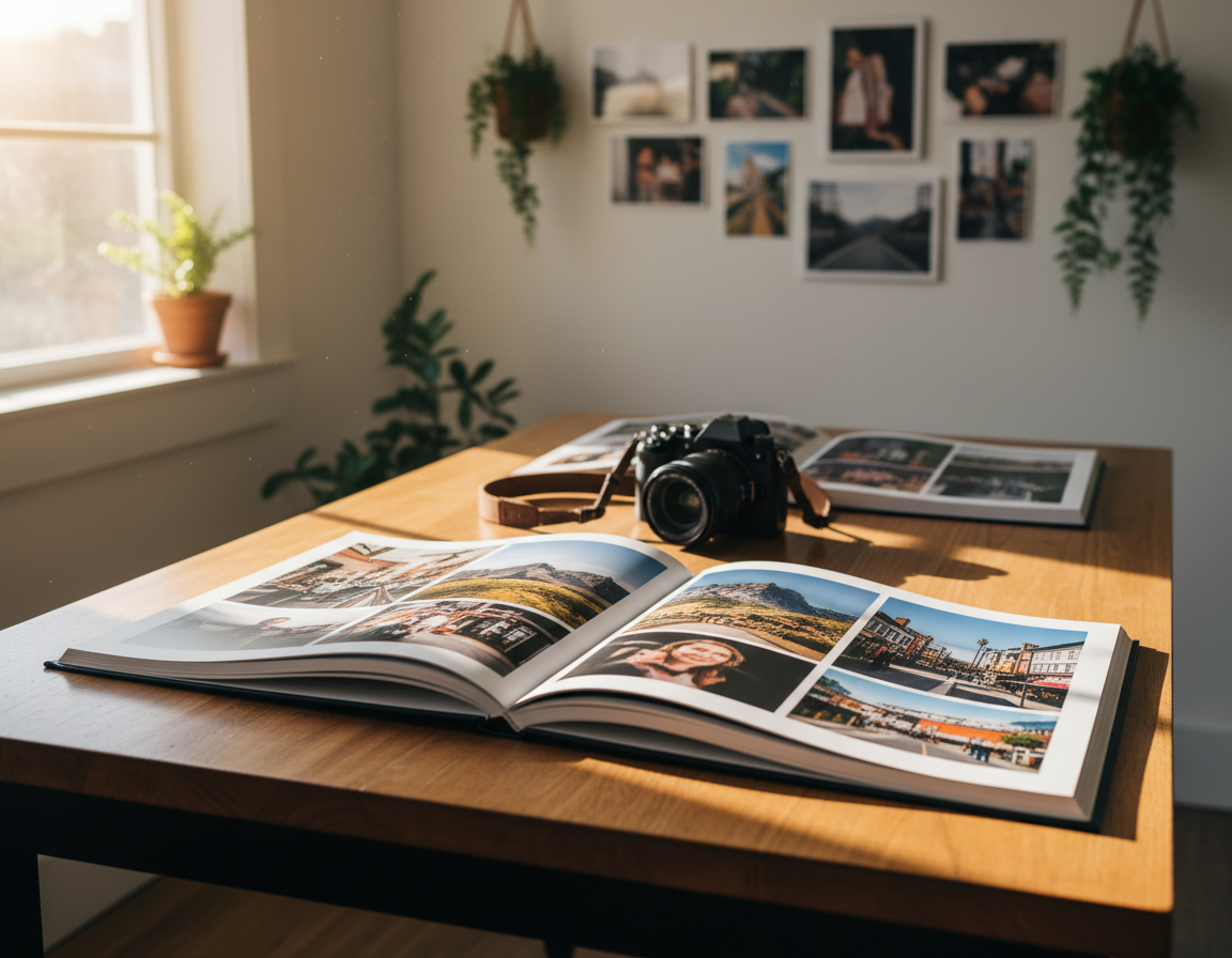
Export, Save, and Share Without Losing Quality
Create a clear save-and-export routine so you can return to originals and try new looks without quality loss.
Keep the original file. An untouched RAW or master TIFF lets you restart later. Many modern photo editors work nondestructively, storing changes as instructions rather than rewriting pixels.
Practical export guidance for social and print
For web and social, export a high-res JPEG sized to the platform’s recommended dimensions. Avoid heavy compression; let platforms downscale rather than uploading tiny files.
For print, export at full resolution, use 300 PPI where required, and pick a color profile the printer requests.
Quick final checks before sharing
- Confirm crop and aspect ratio match the intended use.
- Make sure horizons are straight and any visible color cast is corrected.
- Check exposure and perceived sharpness at 100% and again at fit-to-screen.
- Keep organized folders by date or shoot so originals and final images are easy to find.
| Goal | Format | Resolution | When to Use |
|---|---|---|---|
| Social | High-quality JPEG | Optimized dims (platform recommended) | Fast sharing, web display |
| TIFF or high-res JPEG | 300 PPI or printer spec | Fine art, gallery, large prints | |
| Archive | RAW or master TIFF | Original capture size | Future re-edits, alternate versions |
Conclusion
A compact, repeatable workflow — preset, crop, exposure/contrast/tones, white balance, detail, cleanup, export — turns good captures into reliable results. Use this order each time to remove guesswork and speed progress.
Basic photo editing usually beats complex edits. Get exposure and contrast right first, keep tones balanced, and correct white balance before chasing a stylized look.
Pick one program and practice the same process for several sessions. Consistency saves time and makes your style clearer.
Next step: edit ten photos following the sequence, export, and review them on another device. Save the settings that work so future work runs faster.
Keep practicing, note what you like, and build your style step by step.